Wednesday, December 4, 2013

Exercises in style with Matt Madden


"Exercises in Style" book by Matt Madden (inspired by:).......
 
 
In this assignment we had to choose an artist, cartoonist or illustrator and use this style to create a new version of our template comic page.
For the fun of it, I picked Paul Klee. The result is not as organic as I hoped, because the original printing technique that Klee used for his prints would have been too long of a process. I did a few prints and traced it in Photoshop in stead. The line art is made with a thick pencil. I tried using Ink and dip pen but I realized it looked to tight for the style of Klee.
 
I made it in two different formats.


This was another version, with changed ankles or point of view. I changed mine style wise as well. I tried to make it more graphical approach, showing each side of the table in each panel, tricking the reader to think it is the entire table/ the corner of the table, thought the characters sit on each side of a table facing each other.


5 commands/rules from my neighbor that I had to follow made me do this little comic.
 
Swash-buckler style (what ever that is)
 
  My template comic. (this comic is the basic of all the other comics. They are based on this simple version)


Monday, December 2, 2013

Perspective class with Lawrence Marvitt

2. week with Lawrence was a class in Perspective drawing. The first couple of days we worked with figure drawing, thinking of the figures (in this case tree people dressed up as super heroes) as objects in space. Every object should be seen in terms of a volume - this going a round the form - showing the  "eternal" of the shape. This means that you should always draw around the form to understand it's volume.


We talked about Clear design, how to use different shapes and what a specific shape tell as a story. On this subject we had to design a weapon from Atlantis.
I made a knife designed after a sea horse. And I'm not super satisfied because of the line language and not so varied shape variations. So I saved that drawing from my blog.

Next exercise was an extension of the Atlantis weapon - A 1 day assignment.
We had to make a digital line drawing of the imaginary city Atlantis. This was focusing on using the media, making a correct perspective based on a imaginary picture . clearly distinguishing "water city/Atlantis)
This Is was I came up with. The line quality is really horrible because this is the first time I really sit down and draw in Photoshop. It tool me a while to get use to it - witch also was the reason why I had to do the 3. assignment twice - my line work was way to sloppy when working in photoshop .  


 3. exercise was another perspective assignment, choosing between "science fiction laboratory" or "antique shop". I those the Antique store, mainly because I don't know much about science fiction, and because I normally draw much more organic shapes.

This was my second line art work. The first one is basically the same, but not as clear to read.
On top of this we had to make a Rendered version. The rendering should be done "on top" of the line work - using the lines to help you distinguishing the shapes. But the finish rendered drawing should work without the line art.  


3. Rendering:

This is what I had time to do for my rendering. I need to finish it up. But I work really slow in Photoshop still.


This is my finished result. 

Tuesday, November 19, 2013

a little sneak peak on the 20 page comic

Today we worked with test pages. Trying to find out the style for our comic. This is a tuff decision because you have to think about what is even possible for the amount of time you will have to finish it. I made these two examples, and think I will go with the upper example. I like the ruff feeling in the line quality.
 
My story will be about a Giant Woman, a group of tiny men and a bird.


Saturday, November 9, 2013

Last week was one week with a wizard.

The maker of the Taynikma comic series 
Murlin P. Mann


In this week we studies story structure and how to split up your story and put it in a simple and clear form. 
We made an Outline and a storyline for our story. 

Here is my PITCH: 

Tuesday, November 5, 2013

Artem Alexev - life drawing class. Sketching

 
 In Last week we went back to classic sketching an life model drawing. Trough the week we had one model to pose for us in 1 - 5 minutes poses; working with ink, markers and pencil. The focus was form and shape, mass and movement.
 The last two days We worked more artistically - making characters and creating an image out from a life modil thinking in "abstract" - and in a clear graphic sense.

The drawing below are sketches. Trough the week. More to come.  


Sunday, November 3, 2013

Design With Lawrence Marvitt

The first week of design was really an aye opener. We worked with composition in it's pure and simple form - though figuring out that this is not as simple as it may seem.
 
Looking at great master painters and graphics I realized that the simplicity of the composition in contrast to the complicated techniques is the answer of an strong image.
 
Trough the week we had some different assignment - some more abstract than others.
First we should make a composition of three rectangles creating as dynamic picture as possible . No one really succeeded this.  
 
The next assignment was to work with making clear pictures - describing a "taste".
 
We got handed out a peace of chocolate and should  now then in words and poetry try to describe the taste of dark chocolate within a feeling - a place - a mood or a memory.
When you have decided your "poetry" you should then create a clear abstract image that would described your atmosphere of the taste.
I had some troubles deciding but in the end I went for
"Corn field after thunderstorm" /Corn field just before storm breaks out.
This was some of the images I did (though I see they are not "clear" in the respect of my sentence)


The next assignment was to do the same - now with sound in stead of taste.
We should hear the album of Miles Davis "Kind of Blue" and make a graphic of the mood in the tunes.
I Now see I went for the wrong one.
"Mustage blowing playfull in the wind"
 

The last assignment was over two days (the others was one day assignments)
We should come up with a strong simple image with a Clear focus point in the theme
CIRKUS OF DEATH:
This is my result. (working for the first time in photoshop)


COMIC!! oi oi oi!


Hvorfor vælge?

Friday, October 11, 2013

 
Franquin assignment - "The Road"


This week we have work with the art of Franquin in the period from 1956-1958.
The first two day went with research, reading and analyzing the style of his comics. We based this research on the book "Splint &Co." With is a Danish translated collection and analytic elements of his work in exactly this period.
 
Wednesday we had the pleasure of having an introduction and help from Mården Smet - one of the most technical skilled Danish comic artist.
He would be helping us in the following assignment; making a 1-2 page comic based on a passage from "The Road" in the style an universe of Franquin. A real challenge of contradictions.

We had to use characters from Franquins universe from exactly this period. Though we were aloud to change them in the cause of  fitting to the setting of "The Road" and the characters in the text.


Sunday, September 29, 2013

8 page comic! "Moon Seed"

The past three weeks we have had 3 different teachers all helping us out in the process of making an 8 page comic. (a4 size)

1 week we worked with "world creation" supported by Thomas Thorhauge (http://sacre-bleu.dk/)
We all spend one day developing a setting as a sketch; A place, a time, and maybe some characters, witch could be a foundation for a story. Everything should be open for further work.
This was My result:

"A communist bathhouse for Chinese soldiers - somewhere in china.
 
At the end of the school day it was then revealed, that we were not suppose to work on our own setting, but the setting of our neighbor student.
 
My NEW setting, which I would have to work with the following two weeks was then : "Russian village in the age 900 - invade by Vikings ".
 
We then started to build up ideas for stories, making sketches and character design. In the end of the week we had to make a PITCH to the rest of the class - "selling" our idea. For this we had to be clear about our story line, our characters and the title.


The second week of the 8 page comic project went with making thumbnails, page layouts and a final pencil version of the comic supported by Johan F. Krarup (http://jfkra.dk/)
We had ONE day to make our thumbnails (: miniature quick sketches of the whole comic including the story line and a bit of layout - only for us to read)
 
This was then my final 8 page pencil version.


page 3

page 4
page 5

page 7


In the third week of the project we had to work with INKING styles supported by Lars Horneman (http://larshorneman.blogspot.dk/)

Before inking our comic we spend two days on trying out different inking styles/finished product styles.
Day one we had to work with a panel from our own comic making it in 3 different styles. Here is two of them.

 
Day two we had to ink a page from another persons comic.  This was my page:
 
 
In the end we had three days of inking our own 8 page comic.
My plan was to have mine made in black, white and then a yellow tone (as the styles above)
But time past quick and in the end I only finished it in black an white. For the inking I used an old type of brush and a dip pen - correcting things in Photoshop.
 
So this was my result!
I call the comic:
MOON SEED


Sunday, September 22, 2013

12 page comic "FACE"

In the week with Poul Karasik we had a big challenge in making a small 12 page comic book (a5 size).
This comic should be about a personal memory - something that might have changed us.
Though the story should be structured out from the reality - we could twist it in what ever direction. We could change time or details that may not was in the true memory - but somehow would fit the "message" or make the storytelling more clear.
I experienced that working out from a personal memory was difficult. You had to deal with emotions and things and somehow start to analyze it so that it actually fits a readable comic book.

We started out making thumbnails (small drawings of whole page).
Writing a manuscript
Making a structure within the text and the panels; size, flow/tempo, ect.
Full size sketch - giving overview.
Making a final pencil version
Ink it (by hand on light board)
Correct in photoshop.

I must admit that my process of making this comic included a lot of troubles. I started with a complete different story, but then started this one two days before the actual hand in.
The main idea about this comic may not work optimally, but trough the end of the story I some how started to figure out some more things about the use of panels. The intention of using different styles also might me confusing - but at least it was the experience worth it.
So here it is.
Don't take it too seriously.

My first 12 page comic.

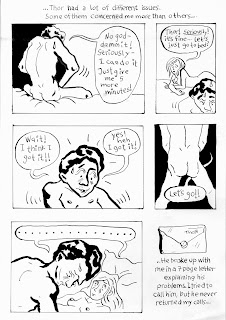
This is an assignment from Graphic Storytelling 2013 taught by Paul Karasik at The Animation Workshop/VIA UC